
What we've been changing in Hookology over the last few weeks: lead figures for lead businesses, honest gaps and freshness stamps, a dashboard that starts with what changed, and what we learned.
It usually starts with one small question in a review meeting. Someone points at a box on the screen and asks, "Why does that say £0?" Or, "When was this last refreshed?" Or, my least favourite, "Is that green arrow actually good news?"
If the honest answer is "I'm not sure", the meeting changes. People stop trusting the number in question, then the numbers next to it, and before long someone is exporting a spreadsheet to check it by hand. A decision tool that cannot answer those questions is just another report.
When Ellie wrote about why we built Hookology, the idea was simple: connect marketing data to the realities of a business, then help a team decide what to do next. Over the last few weeks we have been using it every day on real accounts, writing down every moment like that, and fixing them one by one. This is a working note on what changed and what it taught us.
The question behind every change
Almost every update over the last few weeks came back to one test: would I act on this number without checking it somewhere else first?
That sounds obvious. In practice it meant looking hard at places where Hookology was quietly guessing, filling gaps with zeros, or calculating the same figure two different ways on two different pages. None of those things look like bugs on their own. Together, they are what makes a team stop trusting a tool.
So the work fell into three themes: speaking the language of lead businesses, admitting what we do not know, and making the dashboard start with what actually changed.
Speaking the language of lead businesses
A lot of the businesses we work with do not sell online. They want enquiries, bookings and phone calls. Yet in places Hookology was still showing them revenue and ROAS, and filling boxes with £0 because there was no revenue to show. A screen full of £0 tells a lead business nothing, and it quietly suggests the tool was not built for them.
We went through it page by page. Clients whose goal is leads now see leads, cost per lead and conversion rate across the dashboard, the Opportunity Engine, forecasting and the creative views. The Opportunity Engine no longer claims a revenue potential of £0; it says how many opportunities are active, how many are high priority, and what each one is expected to do for leads.
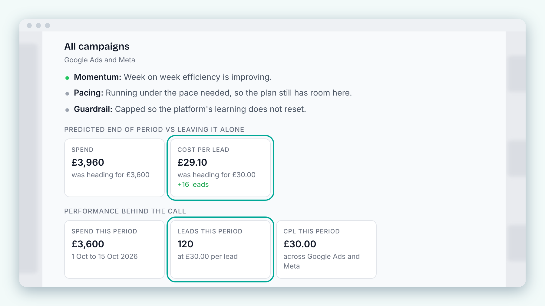
Budget Shifter now shows what a move does to cost per lead and leads, not just spend.
Two smaller fixes mattered more than they sound. Cost per lead is now calculated the same way everywhere, using the lead conversions each client chooses as their primary goal. And a rising cost per lead now shows in red. It used to show in green, as though it were good news.
We also added an optional value per lead for each client. Once it is set, ROAS and POAS appear for lead clients, clearly labelled as modelled from that lead value. A lead business can now see a return on its spend without us pretending we know its revenue, and the label always tells you where the figure came from.
Saying "we do not know" out loud
The second theme was honesty about gaps. An empty or all-clear screen is worse than an error, because it looks like good news.
Freshness and failure
Pages across the workspace, such as Data Sources, KPIs and Goals, Revenue Attribution and the Campaign Calendar, now carry a freshness stamp like "Refreshed 5 minutes ago". You no longer have to wonder how current a figure is.
When something fails to load, Hookology now says so. Instead of an empty page that implies there is no data, you get a clear "Could not load" message with a Retry button, and retrying keeps your filters and settings exactly where you left them.
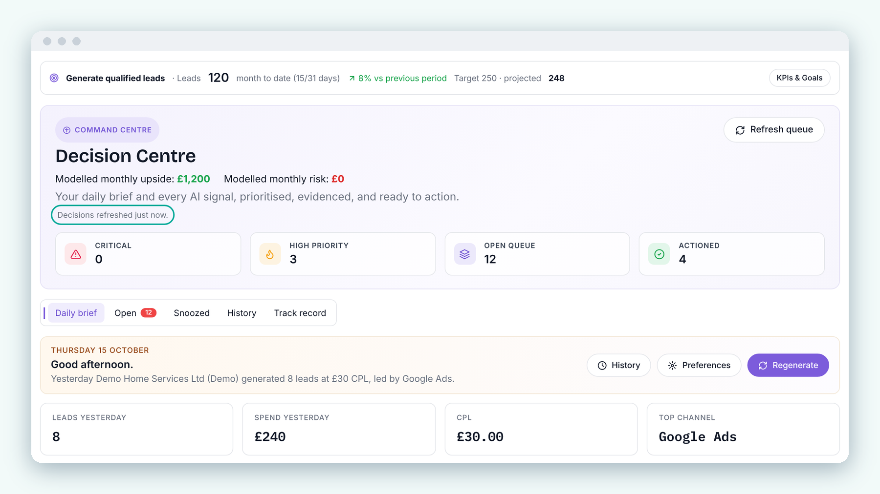
The Decision Centre now tells you exactly when decisions were last refreshed, so you know how current the advice is.
No prior data
Comparisons had a quieter problem. When there was nothing earlier to compare against, some screens showed 0.0% or a cheerful green increase. Now they simply say "No prior data". It is a small piece of wording, but it is the difference between an honest gap and a misleading trend.
Both sides of attribution
Attribution is where trust is hardest to earn, because every platform tells its own story. The Attribution page now shows tracked conversions and platform-reported conversions side by side, each clearly labelled, and the platform figures note that they include view-through. Waste suggestions follow the same rule: they show only what the evidence supports, with the method spelled out next to each figure.
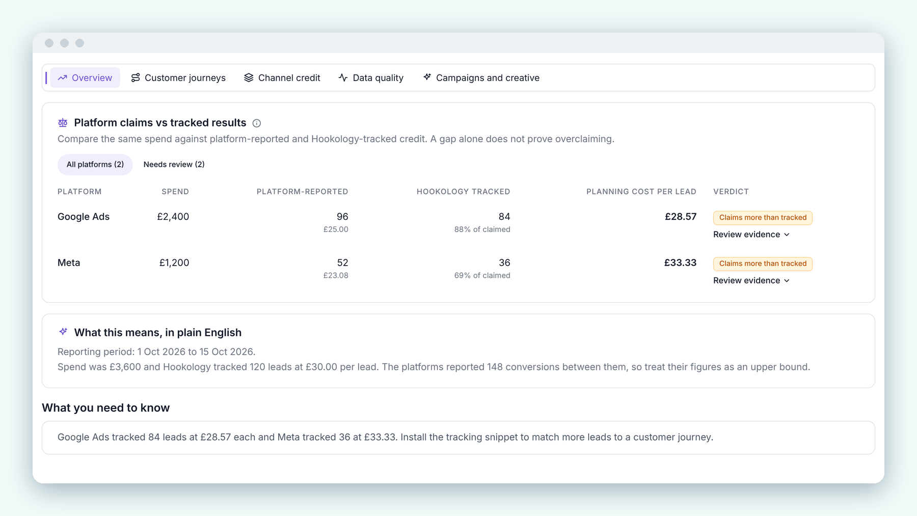
Platform claims and tracked results side by side, because a gap alone does not prove overclaiming.
We are not asking anyone to pick a side. We are showing both, and saying exactly what each one counts.
A dashboard that starts with what changed
We did ship some genuinely new things, and they follow the same thinking.
The Command Centre dashboard now opens with a What changed box under the headline figures. It lists the biggest movements since the previous period in plain sentences, with a one-line verdict at the top. Below it, Path to goal tracks the active goal: the current forecast, the gap and the days left, with an honest badge when the target looks unlikely. It never invents a route to the goal when the numbers are not there.
If a section is not useful to you, a new Customise option lets you hide it. The headline figures always stay.
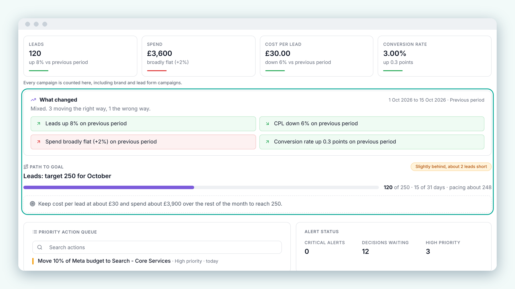
What changed sums up how the period is moving in plain English, and Path to goal tracks progress towards the target and what it will take to get there.
The Decision Centre
The Decision Centre is where recommendations turn into actions, so it needed to be clear about time. Every suggestion now shows when it was made, and when it was approved, dismissed, implemented or snoozed. The queue can be sorted oldest first as well as newest first, grouped under headings such as Today, Yesterday and Earlier this week.
My favourite addition is the quick buttons above the list: how many suggestions arrived in the last 24 hours, and how many have been waiting 14 days or more. In a review meeting, that second number is the useful one. It shows what has been sitting there and needs a decision.
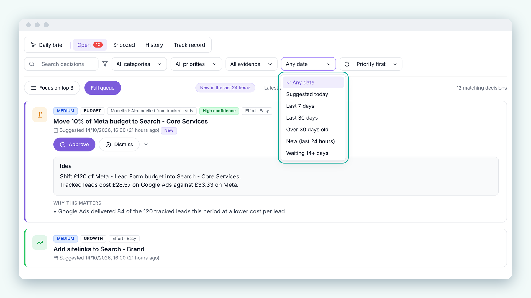
Filter decisions by when they were suggested, from today to anything waiting 14 days or more.
Conversion rate, at a glance
Website Performance has a new Conversion Rate card showing the rate for the selected period, its change against the previous period and a small trend line. It follows your date range and filters like every other card.
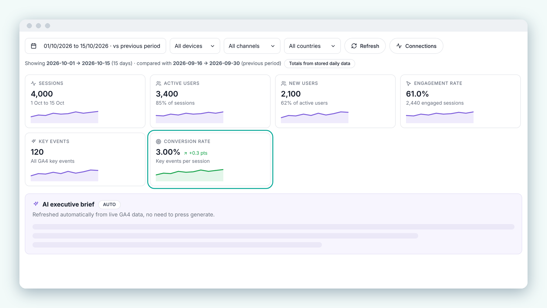
Website Performance now includes conversion rate alongside sessions, users and engagement.
The plumbing nobody sees
A lot of the recent work happened in places you only notice when they break.
Google Ads and Meta syncs now save results batch by batch as they arrive, so large accounts are far less likely to hit a failed sync or stale figures. One account was handling more than a million tracking events in 30 days, and the request that gathered them was timing out; we moved the heavy sorting into the app, so Profit Intelligence, the budget pages and Hook AI now open quickly for high-volume accounts.
When a connected platform asks Hookology to slow down, Data Sources now shows how long the pause lasts and when the next automatic try will happen. Reconnecting Meta, Google Merchant Centre and Pinterest is more straightforward, with plain explanations rather than raw error codes. Editing a platform budget only confirms once the change has truly saved, and if it fails your previous value stays put. Month-to-date pacing now uses one shared UK-time calculation across Forecast, Path to Goal and budget pacing, and saved date ranges stay put across pages and client switches.
We also walked the whole workspace on phones, tablets and large screens, fixing figures that broke mid-number and labels that split mid-word.
What the last few weeks taught us
Three things stood out.
Consistency is a feature. When the same figure is calculated two ways on two pages, people notice before you do. Making cost per lead work the same way everywhere did more for trust than any new chart.
"No prior data" is a valuable sentence. Telling someone plainly what the tool does not know is what makes everything else on the screen believable.
Lead businesses are not a special case. We had treated them as a variation on ecommerce without meaning to. Fixing that touched almost every part of the product, and it was worth it.
What we are working on next
The next area we are digging into is attribution modelling. Showing tracked and platform figures side by side was the first step; the harder question is how to give each ad network fair credit for the part it actually played. That work is in progress, and we will share what we learn as it develops, including the parts that do not go to plan.
Every release goes into a plain-English changelog inside Hookology, so clients can see what moved and why.
If you want the bigger picture behind all of this, Ellie's post on why we built Hookology sets out the thinking the product started from.
See it on your own numbers
If your team spends more time checking the numbers than acting on them, Hookology was built for that problem.