
Spotify swapped its iconic green logo for a glittering disco ball to mark its 20th anniversary, and the internet had opinions. Here is what happened, why people reacted so strongly and what brands can learn.
Updated June 2026: Spotify restored its original iPhone icon on 11 June, and this article now reflects the full story.
In mid-May 2026, Spotify users opened their phones to find that the familiar flat green Spotify icon had been replaced by a shimmering 3D disco ball. It was part of Spotify's 20th anniversary celebrations, and within days it had become a talking point across social media, though not always for the reasons Spotify might have hoped.
Some people loved it. Many did not. Spotify ended up replying to critics on social media to reassure them the change was temporary, and the original icon eventually returned to iPhones about a month later.
It is a small story about an app icon, but it says a lot about how brand recognition, social media and audience expectations work today. Here is what happened and what businesses can take from it.
What actually happened
On 12 May 2026, Spotify launched Spotify 20: Your Party of the Year(s), a mobile-only feature that looks back at each user's listening history, including their first song streamed, their most-played artist of all time and the number of unique songs they have played.
Around the same time, an app update swapped the standard icon for a glittering green mirrorball that kept Spotify's three curved soundwave lines. When asked about it on X, Spotify replied "isn't she lovely?", and a spokesperson confirmed to Variety that it was tied to the anniversary, though the company initially would not say whether it was temporary.
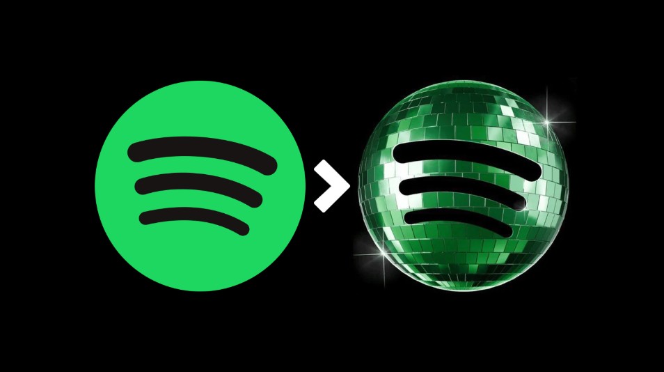
The disco ball icon behind all the conversation
The reaction was loud and mixed. USA Today quoted users calling it "tacky" alongside others who said it stood out and looked clean. Some complained that at app icon size it looked pixelated or, as Variety put it, as if the logo had been "wrapped in cellophane". 9to5Mac noted that part of the problem was that many people did not realise the change was meant to be a short-term birthday celebration.
On 17 May, Spotify responded directly to critics: "We know glitter is not for everyone. Our temp glow up ends soon. Your regularly scheduled Spotify icon returns next week." In the end it took a little longer. According to Variety, an iOS update on 11 June finally restored the original icon on iPhones.
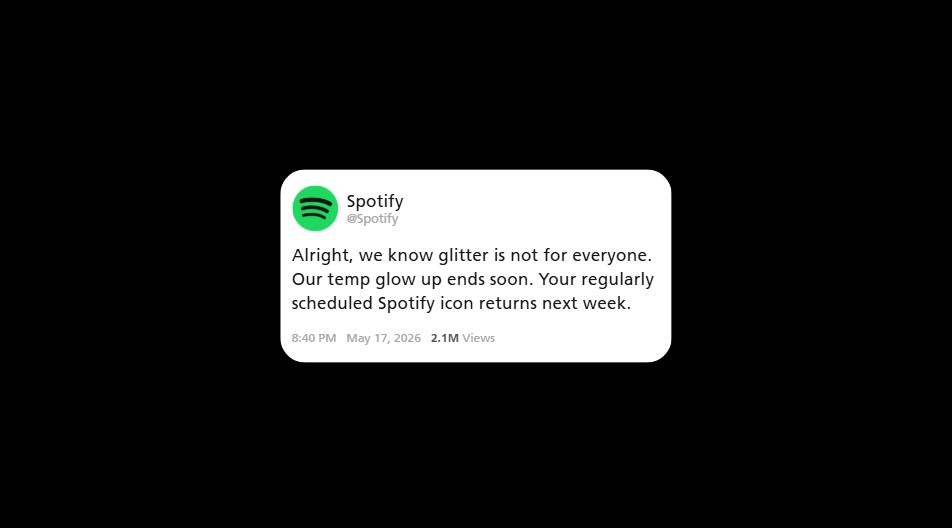
Spotify reassuring users that the icon change was only temporary
Why did people notice so quickly?
Because the Spotify icon is something people see constantly. It sits on home screens and is tapped many times a day, often without a second thought. When something that familiar changes, it registers immediately.
That is a sign of strong branding. Over time, consistent visual assets become mental shortcuts. People stop "reading" the logo and simply recognise it. Change it, and you interrupt a habit, which is why even small tweaks to well-known logos tend to provoke strong feelings.
It also explains why the reaction was not just about taste. For many users, the problem was practical. They went looking for a green circle and found something that, at a glance, looked different.
The psychology behind the backlash
People feel a sense of ownership over brands they use every day. When a familiar brand changes without warning, the instinctive reaction is often resistance, regardless of whether the new design is objectively better. We explore more of these patterns in the psychology of digital marketing.
Spotify is far from the first to experience this. In 2010, Gap replaced its classic blue box logo and reverted within about a week after a wave of criticism on Facebook and Twitter. The difference is that Gap intended a permanent rebrand, while Spotify's change was always meant to be temporary. That made the stakes lower, but the lesson is similar: audiences react to surprise as much as to design.
Spotify did do some things right. It kept the core shape, colour and soundwave lines, so the brand stayed recognisable. And the change was clearly linked to a celebration rather than a new direction.
Social media turned an icon into a news story
Ten years ago, a temporary icon change might have gone largely unnoticed outside design circles. Today, any visible change from a major brand becomes content within minutes. Screenshots, memes, hot takes and polls spread across X, TikTok, Reddit and Instagram, and the media follows.
That cuts both ways. Spotify's anniversary got far more attention than a press release alone would have achieved. But a large share of that attention was negative, and the brand had to spend time reassuring users rather than promoting the feature the icon was meant to celebrate.
Spotify's replies were a good example of handling it well. The tone was light, self-aware and on-brand ("we know glitter is not for everyone"), and it addressed the concern directly. If you manage social channels, it is worth having a plan for moments like this. Our guide to reactive social media posts shows how brands can respond quickly without sounding defensive.
Temporary branding as a marketing tool
Temporary visual changes can work very well when they are tied to a moment people understand: an anniversary, a seasonal campaign, a charity partnership or a major sporting event. They can refresh attention, signal personality and test creative ideas without permanent risk.
Spotify's experience suggests a few conditions make them work better.
Make the reason obvious
If people do not know why something has changed, they fill the gap themselves, often with "they have ruined the logo". A clear message at the point of change helps.
Say how long it will last
Uncertainty fuels complaints. Spotify's eventual reassurance helped, but it came after the backlash had started.
Consider making it optional
When Instagram celebrated a birthday in 2020, it let users choose from a range of classic app icons. 9to5Mac drew the comparison directly. Giving fans the choice turns a change into a reward rather than an imposition.
Test at real size
An idea that looks great on a presentation slide can fall apart at app icon size. Always review logos and icons where people will actually see them.
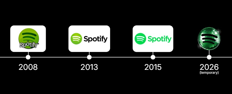
Spotify's logo timeline
What businesses can learn from Spotify
Most SMEs will never face this level of attention, but the principles apply to any brand.
1. Recognition is valuable, so protect it
Strong reactions to change are proof that a brand has built familiarity. That familiarity took years to earn, and it should be changed deliberately.
2. Change needs context
If you are updating your logo, colours or website, tell your audience what is changing and why before they discover it for themselves.
3. Keep the core
Evolve the details, but keep the elements people use to recognise you, such as shape, colour or a signature mark.
4. Design for real use
Check new assets on phones, social profile pictures, signage and favicons, not just on a large screen.
5. Listen and respond
If people react badly, acknowledge it quickly and with personality. A good response can turn criticism into goodwill.
Branding checklist before you change anything visible
- Is there a clear reason for the change that customers will understand?
- Have you kept the elements people recognise you by?
- Have you tested the design at the smallest size it will appear?
- Do you have a short message explaining the change, and how long it will last if temporary?
- Is your social team ready to respond to comments?
Small changes, big conversations
Spotify's disco ball proves that branding is not static artwork. It lives on people's screens, in their routines and in their social feeds. That gives well-known brands huge reach, and it means even a playful change can become a public debate.
At Rise By Digital, our branding and graphic design team helps businesses build identities that are recognisable, consistent and flexible enough to have some fun without confusing customers. If you are thinking about a refresh, from a new logo to a full identity, we would be happy to talk it through.